David Ferriz, Director and Game Designer of the team, on Art Direction of King Lucas.
 In previous posts of King Lucas devblog I pointed out our main inspiration sources for game design were 8 bit games like Alex Kidd in Miracle World, Castle of illusion or Asterix, but I still haven’t talked about the graphics of the game so in this post I’m going to try to explain how we got that special look of King Lucas.
There’s a lot of people who think a retro game is synonimous with pixel art. This is a very usual association I don’t agree much because I don’t think that size of the pixels or the number of colours define how much retro a game is. I remember when my parents bought my first console, a Master system II, and back then I was a child who had no idea about what a pixel was nor how a game graphics were done, for me those characters jumping on screen were just magic. When I recall those games I don’t recall them pixelated, maybe because of the blur of my old tv, but I prefer thinking it was because I looked at them with the eyes of a child, eyes that used to let me immerse myself in a world full of colour and set my imagination free in a way that actual games can’t achieve. Don’t get me wrong, maybe this is not because of actual games but just because I don’t look at them with those eyes of a child.
When I began working on King Lucas graphics I was sure I didn’t want to limit myself to make a game with pixel art and a 16 colours palette in order to get an 8 bits style, what I wanted was to feel King Lucas the same way I felt 8 bit games when I was a child, I mean, without limits of colours, size or resolution.
The characters
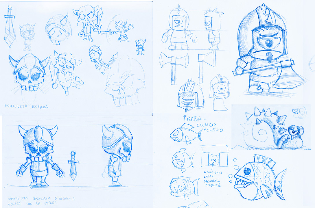
 Even though King Lucas may be defined as a metroidvania, our inspiration in terms of game design and art have been always quite far from titles as Castlevania or Metroid, because of this when I started designing characters for the game I never imagined them tall and stylized, in my mind they were shorty, cute and big headed like Alex Kidd or Wonder Boy. I had this so clear that most of the concepts were born at first intent, almost automatically. This is not very interesting for the making of, but we really didn’t have a big documentation stage, we didn’t do hundreds of sketches and we didn’t studied the market in order to find out which style was selling the best, I just drew the characters that were in my mind since I was a child, just as I remembered them.
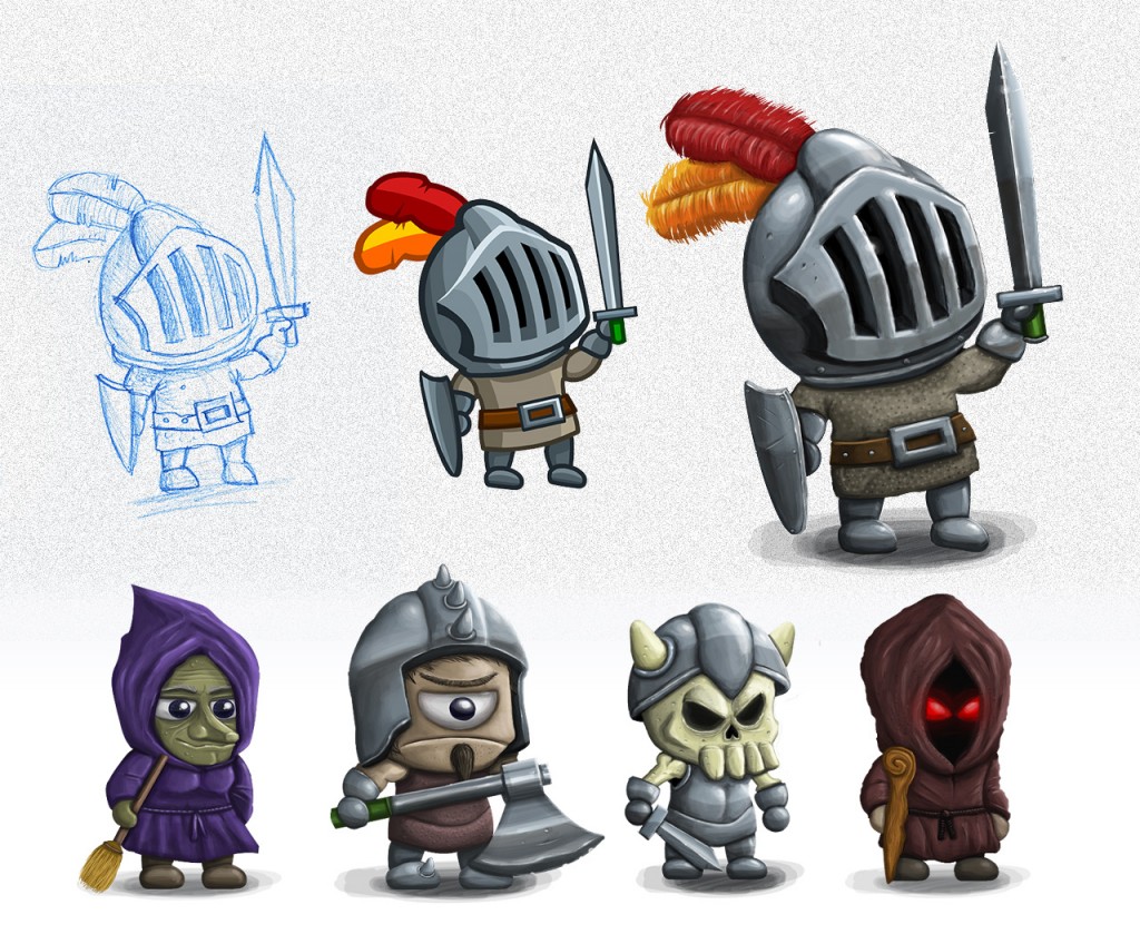
The first character I designed was the hero and that was the main reference to design the rest of them together with my workmates Antonio and Lidia. In total, there are more than 50 characters in the game counting enemies, bosses and NPC’s, and all of them were created following the same process: first a pencil sketch and then a sliced vectorial version ready to animate. We used vectorial versions for long time but, at some point, we decided to give more depth to the scenes, making them become 2.5D in order to get a richer visual experience, so we also retouched the characters giving them some paintwork with the Wacom. This way we got more detail and volume, according to the new style of the scenes.
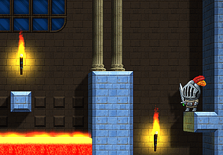
The scenes
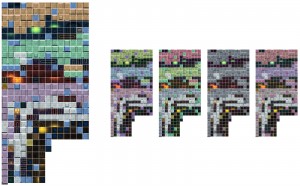 As I explained in the post about level design, the rooms of the castle were tile based. We initially made a tileset with 4 different coloured rooms but in the first stages of testing some people told us it was a little bit monotone, so we looked for a solution to offer more graphic variety without drawing new tilesets because there was no additional time nor budget for it. We found it again in the oldies, in the 8 bit games where artists and programmers had to struggle with limited colour palettes to get visually rich games without increasing the weight of the game too much and, basically, that was what we did: we modified the palette of the existing tileset to get new shades in each quest. It seemed to work out because no tester has complained about this since then!
The overall
To finish the integration of the character sprites into the 2.5D levels we took advantage of the Unity lights and shades features that gave more depth to the final result. We also modeled some objects completely in 3D such as barrels, doors, coffers or items, creating a link between the scene and the hero, who can interact with them. Anyway, we didn’t want the game to look very 3D so these details are quite subtle and you will appreciate them only if you take a close look.
To change the graphics look from 2D to 2.5D in the middle of the development had a huge impact on our timing and it gave quite extra work for programmers and artists but it also let us achieve stronger and more personal visuals, something different to most of the actual games.
After 4 years working on this, it’s difficult to be objective but, being honest, when I tested the first complete beta of King Lucas, its graphics took me to that place in my mind where I keep my childhood memories of playing 8 bit games. Now I only hope that when we publish the game, lots of users born in the 70’s and the 80´s will also recall those feelings they got with their old games, but now in full HD, with millions of colours and without having to play characters drawn with massive pixels.
Remember that you can sign up to the distribution list of King Lucas in order to be notified as soon as the launch discount is available at www.kinglucas.com!